Please type any word and change the face you would like to see displayed.
Libertine Fonts
Libertine Fonts is a collection of libre multilingual fonts.
Multilingual
Libertine Fonts support the western languages and provide many special characters. Our fonts cover the codepages of Western Latin, Greek, Cyrillic (with their specific enhancements), Hebrew, IPA and many more.
Stylish
Libertine Fonts are different. We don’t copy standard Windows or Macintosh fonts such as Times (new Roman) or Arial/Helvetica, which are ubiquitous anyway and thus causative for the widespread typographic monotony. We want to give you a professional alternative. To enhance diversity and optimize the face Libertine Fonts make use of design features such as ligatures, small capitals, different number styles, etc.
Smart
 Libertine Fonts support smart font techniques such as OpenType ligature substitution, different numeral sets, true small capitals etc.
In the following we show you, which techniques are supported.
Small Capitals
 Every style of Linux Libertine contains so called small capitals. They are, as the name implies, little majuscules which have been manually edited from scaled down versions of capitals to look nicely in titles and for emphasis in running text. – smcp, c2sc
Ligatures
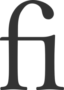
 Libertine Fonts contain lots of different ligatures: the typical f-ligatures, but also Th, Qu and historic ligatures like st und ct, or ſi and tz which are seldom used anymore. – liga, hlig, dlig
Fractions
 Libertine Fonts contain true fractions (like ¼). One-glyph fractions exist for fractions with the denominator two, three, four, five, six, seven und eight. Others, like 1/10 can be composed of “1/” plus inferior 10. You can enable the automatic substitution of the ASCII-input (i.e. 1/2) with the real glyph ½ in good word processors. – frac
Numeral Sets
 Our fonts contain different sets of numbers. The default are the Table Numbers, (Fig: 1st line). They are all the same width so that in tables all digits are aligned in clean columns. This figures also exists as a Proportional Numbers (Fig: 2nd line). Here all numbers have the perfect optical width. The 1 is thinner, for example, than the 8. This looks practically better than the monospaced set, but in tables this set of numbers would of course not align into neat columns. In longer texts one might want to use Medieval Numbers (also known as minuscle numbers), which will better harmonize with the alphabetical glyphs because of their different ascenders and descenders. Such as the standard numbers the medieval ones also exist as monospaced (Fig: line 3, thin zero because of the thin monospace) and proportional with different widths (Fig: line 4).
When majuscules, minuscles and numbers are being mixed (as i.e. in Internet-addresses), you may wonder if the present glyph is an O (Oh) or a 0 (zero). Therefore Libertine Fonts contain marked Zeros – a proportional and tabular one. – pnum, tnum, onum, zero
Stylistic Alternatives
 Libertine Fonts contain different sets of stylistic alternatives for example to change German capital umlauts Ä, Ö and Ü (where the dots are nearer to the glyphs) to tremas (ss01-style-set). The ss02-style-set uses more flexible forms of some capitals, such as of K and R.
Via the salt-table, nearly all glyph-variants can be shown but needed to be selected separately. An example for this behavior is the new German Versal-Eszett, that is being used automatically with capitalization or small caps. Those who do not want this behavior can have the Versal Eszett substituted by SS by using the salt-table.
For speakers of Swiss German, you can change all occurances of the esszet to ss/SS by using the ss03-style-set. – salt, ssXX
Wordending Forms
 In some scripts there are special glyphs for word-endings. For example there is a word-ending-sigma in the Greek alphabet. Because Greek keyboards have both characters available, the fina-table will only substitute the innerword-sigma against the word-ending-sigma for all languages but Greek – fina.
Superiors and Inferiors
 For many scientific publications superiors and inferiors are needed.
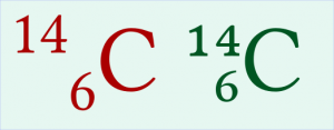
Linux Libertine contains all numbers, as well as the entire basic Latin alphabet, in their optimized superior and inferior forms. Additionally, the plus and the minus glyph, among many others are included.
Unlike the computer simulated inferiors and  superiors (i.e. those used by “M$ Word”) which are generated by simply scaling and repositioning (shown here in red), the inferiors and superiors found in Libertine Fonts (shown here in green) are modified to fit the optical weight of the original Libertine-glyphs. – sinf, sups
Contextual Chaining Substitution
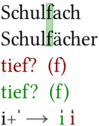
 This genius kind of technique allows the substitution of certain characters in a defined surrounding. In the latin alphabeth this is especially useful in case of the minuscle f, whose long characteristic overbording neck can collide with a following question mark, a closing bracket, accented minuscles etcetera. The figure shows typical collisions in red. To prevent this cases, Libertine Fonts also provide a short-necked f. In case of a problematic pairing the regular f is substituted in favor of the short-neck one (green).
A further use of the contextual chaining substitution is the manual accentuation of letters. Is the vertical bar-accent being combined with an i, for example, it comes to a conflict with the i-dot. In Libertine Fonts the i is therefore substituted by a dotless ı. – ccmp
Libre
Libertine Fonts are free software under terms of the GPL and OFL.
Download
Libertine Fonts are provided as tgz-archives. Windows-/Mac-users may need a proper software such as 7-Zip for uncompression.
 Libertine Fonts at Sourceforge.net
Files with “Font” in file name contain the fonts in OTF- and TTF-format. Files with “SRC” in the file name contain the Fontforge source files
Installation:
Windows: Copy fonts into folder C:\windows\fonts.
Linux: Use system programs such as KDE-Kontrol to install the fonts. These also update Linux specific system files.

